Art
Street Angel
Books, Comics, Zines
Shop
About + Contact
More
Wrestling zine
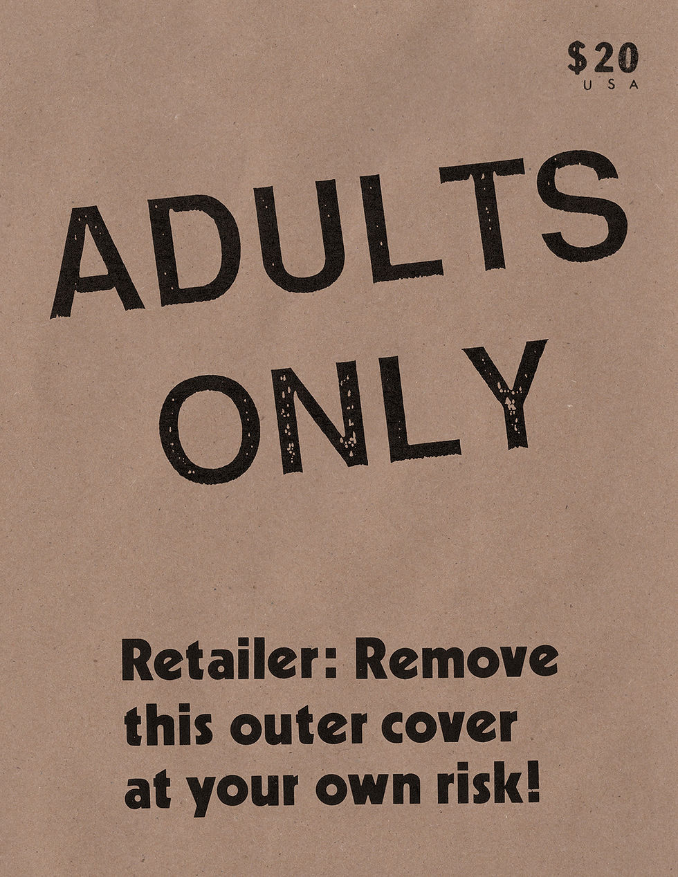
ADULTS ONLY
ADULTS ONLY (Digital Download PDF)
STREET ANGEL HARDCOVER SET
ALIEN DISCLOSURE
ALIEN DISCLOSURE (PDF Digital Download)
ZINE 3 PACK
Supermag
1986 zine
PDF 1986 zine DIGITAL DOWNLOAD
BW Zine
BW zine Digital
Conspiracy Comics 1
PDF Conspiracy Comics 1 DIGITAL DOWNLOAD
True Crime Funnies 1 comic book
PDF True Crime Funnies 1 DIGITAL DOWNLOAD
The JIM RUGG guide to PITTSBURGH COMIC BOOK STORES
JIM RUGG guide to PITTSBURGH COMIC BOOK STORES digital download
Octobriana 1976 -- BLACKLIGHT comic book
Octobriana 1986 -- Black-and-white comic book